Visualizing Argo Data
Last updated on 2026-02-02 | Edit this page
Estimated time: 30 minutes
Overview
Questions
- “How can I visualize tabular data in Python?”
- “How can I group several plots together?”
Objectives
- “Plot simple graphs from data.”
- “Plot multiple graphs in a single figure.”
- “Use Argopy’s plotting functions.”
Visualizing data
The mathematician Richard Hamming once said, “The purpose of
computing is insight, not numbers,” and the best way to develop insight
is often to visualize data. Visualization deserves an entire lecture of
its own, but we can explore a few features of Python’s
matplotlib library here. While there is no official
plotting library, matplotlib is the de facto
standard. First, we will import the pyplot module from
matplotlib and use two of its functions to create and
display a line graph of our data:
Ensuring we have Loaded the Data
Let’s load some temperature, pressure and salinity data with Argopy.
Graphing Temperature Data
Let’s use the Matplotlib library to plot this data. We’ll need to
import from the matplotlib.pyplot library. We can then use
pyplot’s plot function to plot the temperature data.
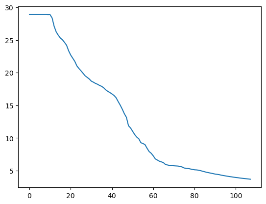
The X axis corresponds to each row in the data and the Y axis is temperature in degrees celcius.
Adding Labels to a Graph
It’s good practice to add axes labels to our graphs, these can be
done with the xlabel and ylabel functions in
matplolib.pyplot.
PYTHON
matplotlib.pyplot.ylabel("Temperature (Degrees C)")
matplotlib.pyplot.xlabel("Reading Number")
temperature_plot = matplotlib.pyplot.plot(temperature)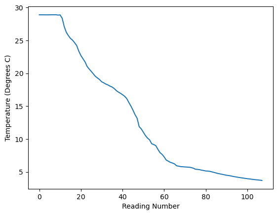
Plot the pressure data
Create a plot showing the pressure (depth) across a Argo profile.
Plot using Argopy
Instead of calling functions in Matplotlib we can also call some plotting functions within Argopy (and these will call Matplotlib for us). This offers two advantages:
- we don’t need to import matplolib ourselves.
- there are some Argo specific plots available within Argopy.
Plotting a Map of Where our Float has Travelled
One of the plots that Argopy can generate is a map showing the position of the float every time it surfaced.
PYTHON
float_data = argopy.DataFetcher().float(6902746).load()
argopy.plot.scatter_map(float_data.index, set_global=False)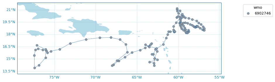
You can also see the same data on an interactive map at https://fleetmonitoring.euro-argo.eu/float/6902746. For some reason the data returned by ArgoPy for this float is limted to the first 118 profiles and there are a few more after that being shown on the fleetmonitoring website.
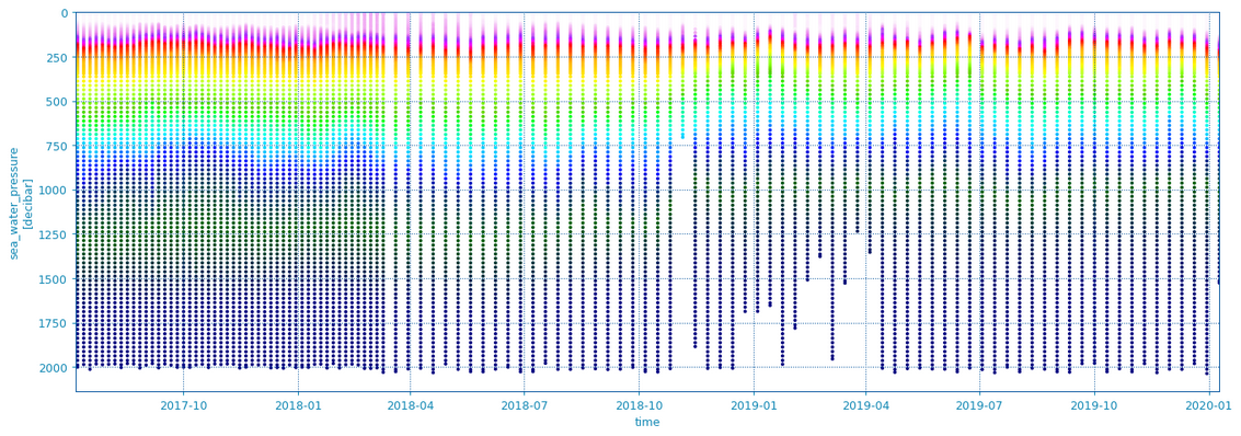
Plotting Temperature Across Multiple Profiles
Another useful feature of the Argopy library is that it can plot data
from multiple Argo profiles (dives). This can be done by supplying a
whole Xarray dataset for all our profiles; we can extract this from the
float_data object we got earlier by calling the
to_xarray() function on it. This can be passed to the
scatter_plot function in Argopy. We also have to give it
the variable name which is “TEMP” (or “PSAL” for salinity). This plot
uses colour to show the temperature and puts depth/pressure on the y
axis and date on the x axis.
Find Another Float to Plot
Pick a different float to load some data from. You can find a list of recently launched UK floats at https://fleetmonitoring.euro-argo.eu/dashboard?Status=Active&Year%20of%20deployment=2025&Country=United%20Kingdom&Network=CORE
Float numbers 7902230, 1902114, 1902725, 1902724, 1902109, 1902111, 1902110, 1902112, 4903834, 4903656, 6990513 or 2903943 could all be good contenders. Some floats will not work because they are missing data and you will ValueError, if this happens try a different float.
Create a new notebook with the following graphs for your float:
- A map showing where it has been
- A scatter plot of temperature against depth over time
- A scatter plot of salinity against depth over time
If you have time add some description about each graph by creating a cell with the Markdown type. Look at https://www.markdownguide.org/basic-syntax/ to see some of the syntax you can use with markdown.
- “Use the
pyplotmodule from thematplotliblibrary for creating simple visualisations.” - “Argopy has its own built in visaulisation functions”